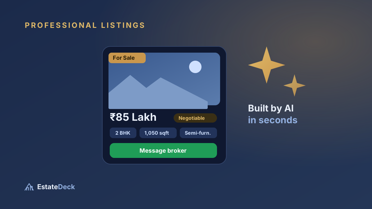
There's a myth that professional-looking listings need a graphic designer, a photographer, and a monthly software bill. They don't. What they need is the right information architecture — the right things, in the right order, presented cleanly. Get that, and a listing you made on your phone can look every bit as credible as one from a national agency.
Here's the anatomy of a listing that earns trust, plus how to produce one for free.
What actually makes a listing look "professional"
Buyers can't tell you why a listing feels trustworthy, but they feel it instantly. It comes down to five things:
1. A strong cover photo
One clear, bright, wide shot — usually the living room or the building — sets the tone. It should be sharp and shot in daylight. This single image does more for perceived quality than anything else on the page.
2. The price, visible immediately
Hiding the price ("call for details") is the fastest way to lose a serious buyer. Professionals show it up front, formatted the way Indians read money: ₹85 Lakh or ₹1.45 Cr, not "8500000". If it's negotiable, say so with a small tag — don't bury it in a sentence.
3. The essentials, scannable at a glance
BHK, carpet/built-up area, furnishing, floor, facing, and locality — shown as clean chips or a short spec list, not a run-on paragraph. A buyer should be able to grasp the whole property in five seconds.
4. A written description that sounds human
Two or three tight lines that a person would actually say: what's special, what's nearby, who it suits. "Bright, semi-furnished 2BHK a two-minute walk from the metro, ideal for a small family or a working couple" beats a list of adjectives. Avoid ALL CAPS and rows of emojis — they read as spam.
5. A clear way to contact you
Your name, and a single tap to reach you on WhatsApp or call. Every extra step between "I'm interested" and "I've messaged the broker" costs you leads.
The photo rules that matter most
- Daylight beats everything. Shoot mid-morning with curtains open.
- Hold the phone horizontally for rooms — it captures the width buyers care about.
- Shoot from a corner, slightly above waist height, to make rooms look their true size.
- Six great photos beat twenty average ones. Cut the blurry and the dark.
Writing a description buyers actually read
Use this simple structure: one line on the highlight, one line on the location/connectivity, one line on who it's perfect for. Keep it specific. "Near everything" means nothing; "5 minutes from Vijay Nagar square, walking distance to schools and market" means something.
How to make it — for free
You have three realistic options:
- Do it manually in a design app like Canva. It's free, but every listing takes 15–20 minutes and you're rebuilding the layout each time.
- Use a portal's listing form. Free to list, but the page lives under the portal's brand, not yours — and your buyer's attention (and future leads) belong to them.
- Use a tool built for this. EstateDeck, for example, lets you send the photos and details on WhatsApp and returns a finished, branded listing page in under a minute — plus a matching PDF property brochure you can print or hand over. Your name, your link, your leads. The first 5 listings are free.
Whichever route you choose, the checklist above is what separates a listing that converts from one that gets scrolled past. The design is the easy part; the discipline of doing it consistently for every property is what makes you look professional.
One habit that pays off
Before you send any listing, look at it as a stranger would for five seconds. Can you see the price? Does the first photo make you want to see more? Is it obvious how to contact the broker? If yes on all three, you've already beaten most of the market.